Advoteck
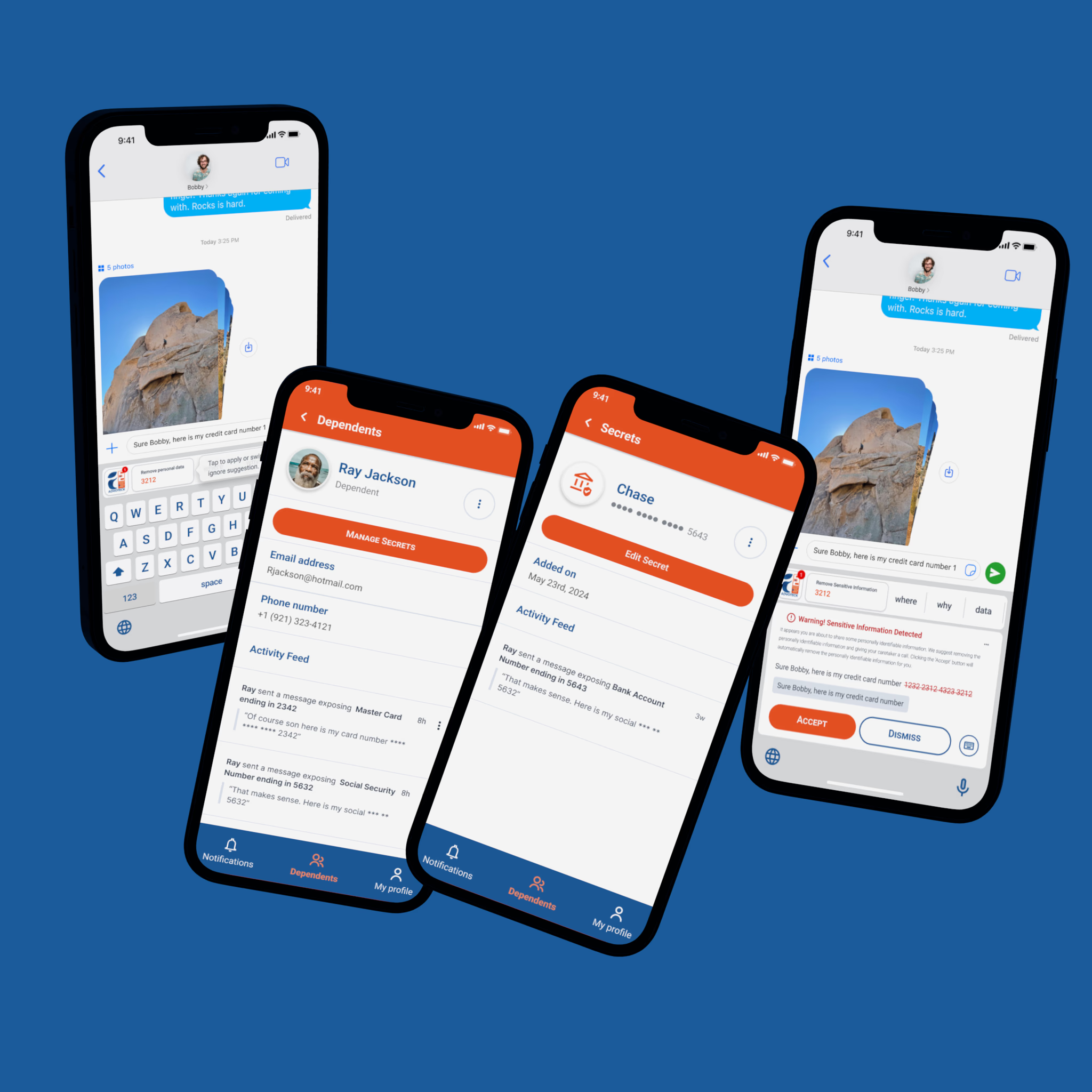
A typesafe keyboard that catches sensitive information before it leaves the phone, and a caregiver app that gives visibility without taking away independence.
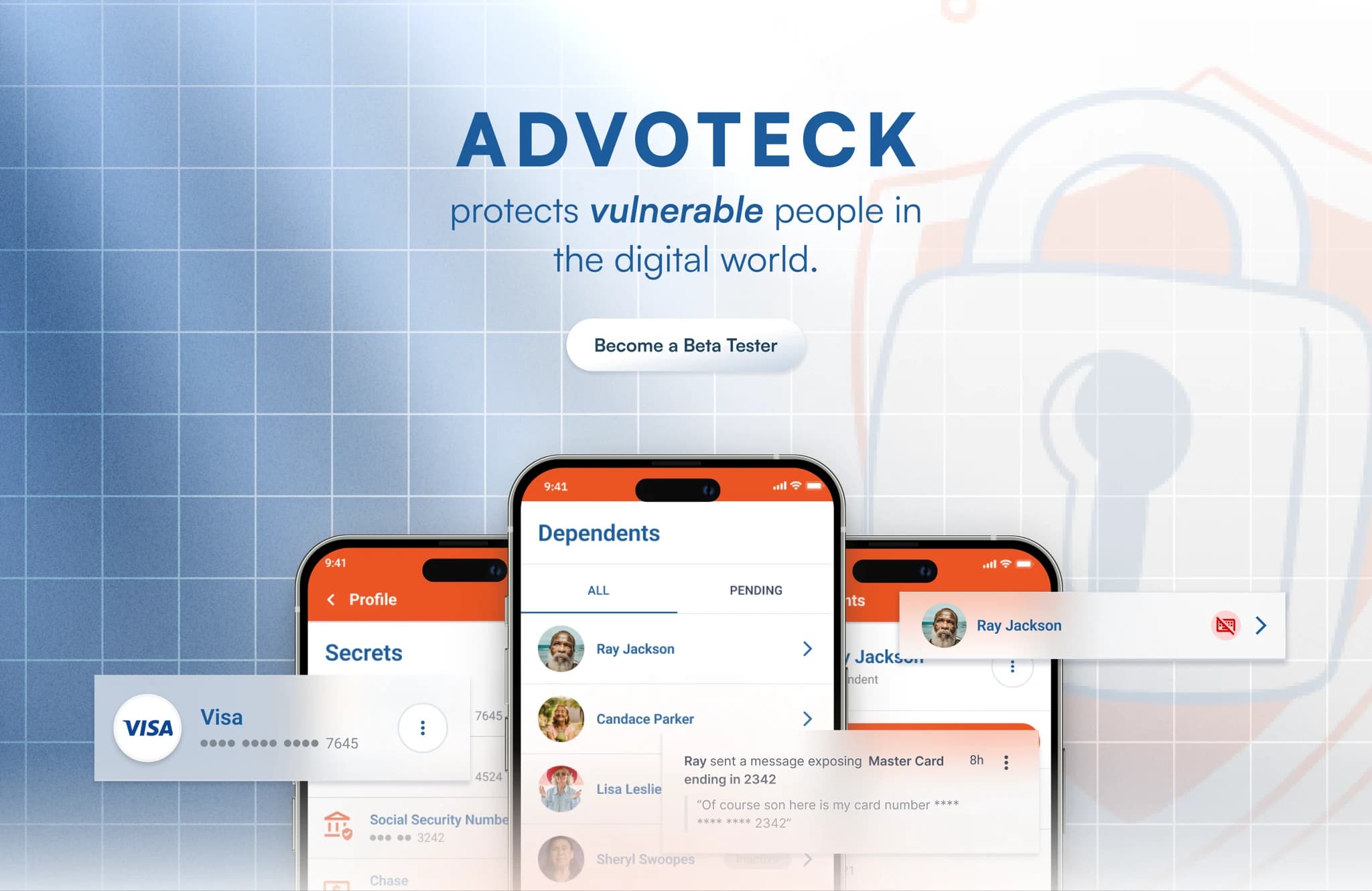
Protection without patronization.
Advoteck came to the team with a mission that was personal for their founders. One had a special needs sister who had fallen victim to online scams. They wanted a mobile experience that quietly protects vulnerable users from digital harm without eroding their independence. The development agency they hired brought me on as a freelance designer to make that vision real.
The solution is a typesafe keyboard. It detects when someone types sensitive information, Social Security numbers, credit card details, addresses, and alerts a caregiver in real time. Instead of blocking the user it educates them with gentle, contextual nudges. Protection without patronization.
There were real holes in important flows, which meant jam sessions between me, the development team, and the founders. Those meetings guided the project and got us to the deadline.
The challenge was translating an emotionally charged mission into something clear, accessible, and technically feasible.
Brought in to unblock the build.
Freelance product designer, brought on to unblock the development team. Redesigned screens, defined critical flows, and ran jam sessions with developers and founders to close gaps before the deadline.
Two people who want opposite things.
Two distinct personas, and getting the balance between them right was everything.
Vulnerable users, meaning people with cognitive disabilities, tech-novice seniors, and impulsive teens, were who we were designing for. They primarily used social media, which is exactly where they were most at risk. Here is the tension. They wanted freedom and normalcy. Anything that felt like surveillance would be rejected immediately.
Caregivers were overwhelmed, juggling responsibilities, learning about breaches only after the damage was done. They did not want control. They wanted visibility. A low-maintenance, trustworthy tool that gave them peace of mind without turning them into wardens.
The founders had done foundational research before I came on, including interviews with caregivers and conversations with digital safety advocates. I built on that and ran additional usability testing on early wireframes to pressure-test the flows. Three insights shaped everything. Trust was paramount, cognitive load had to stay minimal, and feedback preferences varied wildly. Some people wanted detailed alerts, others wanted to be interrupted as little as possible.
Four components, each earning trust alone.
I started by mapping parallel journeys. The vulnerable user typing sensitive information, and the caregiver monitoring alerts. That exposed friction points, trust gaps, and the emotional weight of every interaction.
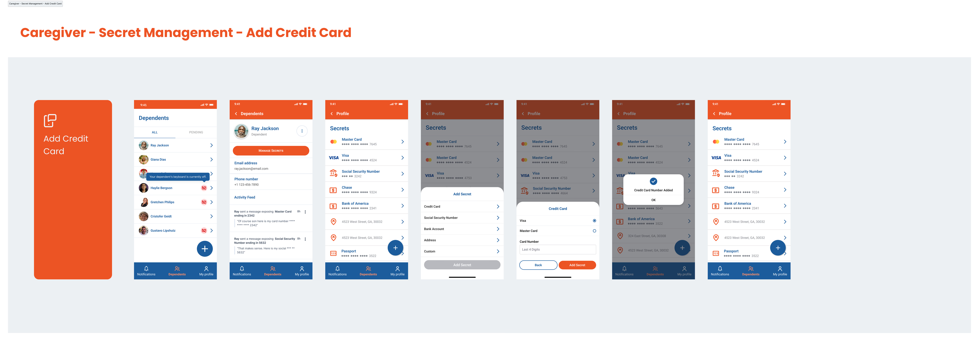
From there I defined four core components. The typesafe keyboard, a caregiver management app, a real-time alert system, and transparent onboarding. Each one had to earn trust independently.
The keyboard was designed to be subtle. Gentle inline nudges for flagged content, passive monitoring with adjustable sensitivity, educational messaging instead of hard blocking. It is not a warning system. It is a quiet guide.
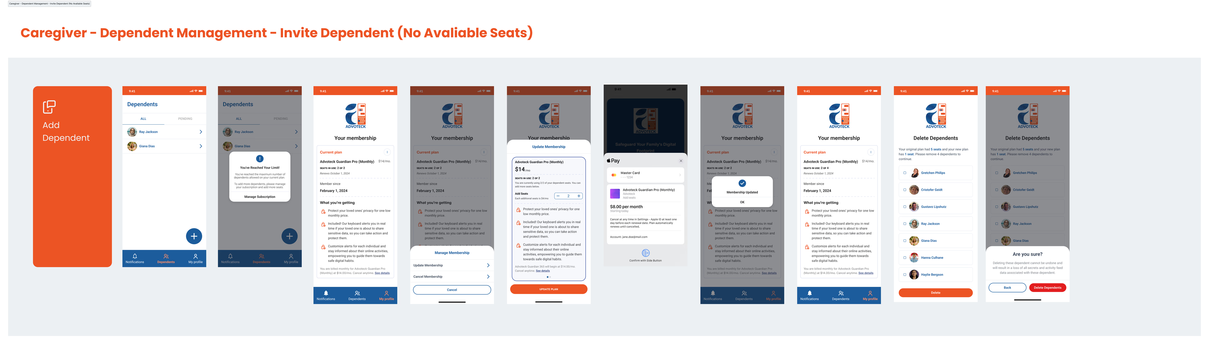
The caregiver dashboard focused on confidence, not control. Setup for secrets like SSNs or card numbers, real-time notifications, sensitivity settings per user. Different alert severities triggered different actions. Some logged silently, some alerted the caregiver, some triggered intervention. I designed fallbacks for false positives, because nothing destroys trust faster than crying wolf.
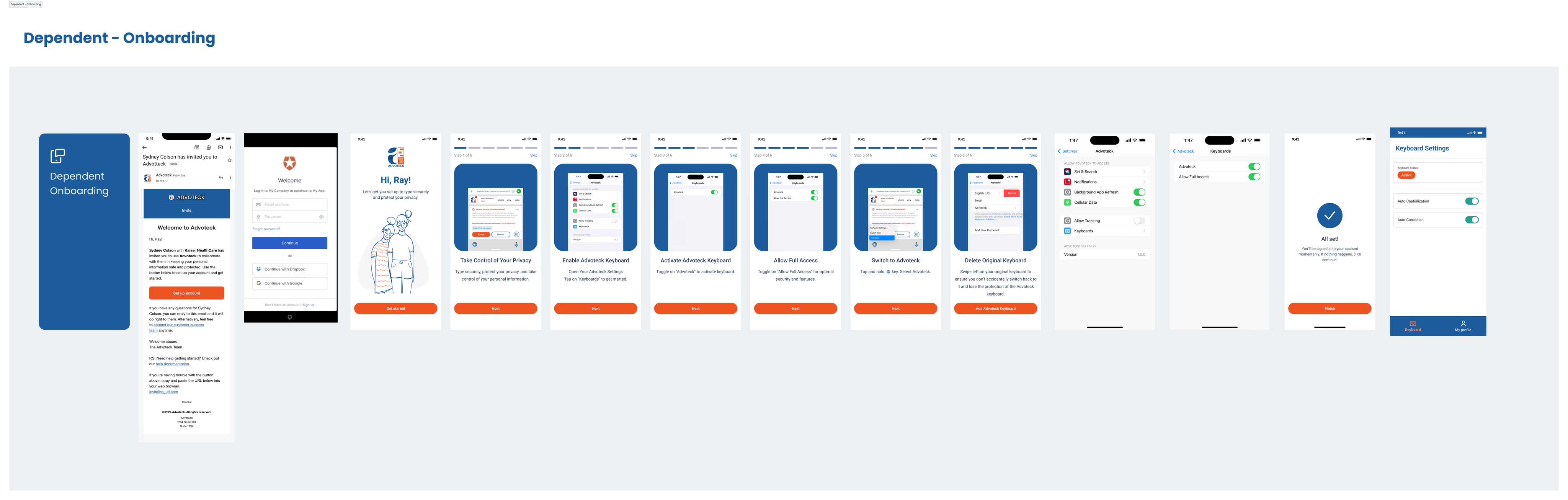
Onboarding explained exactly what the keyboard does and does not do. Plain language, tooltips that say why we ask this, privacy and user control front and centre.
Calmest when the moment is worst.
Every visual decision served the emotional context. We were not designing for power users. We were designing for people who might be anxious, confused, or under pressure.
The palette stayed neutral and warm. Soft blues and greys that feel safe without feeling clinical. Rounded elements and soft shadows reduced visual tension. Clean typography and gentle animations kept cognitive load low. High-contrast colour modes and dyslexia-friendly fonts were built in from day one, not bolted on later.
I tested specifically for cognitive load during risky input events, the moments when someone is about to share something they should not. The interface needed to be calmest when the situation was most urgent. Fat thumbs, shaky hands, and emotional stress were all accounted for in touch targets and interaction design.
The whole system was designed to feel like a trusted companion, not a surveillance tool. That distinction drove every decision.
Teaching beats blocking.
Advoteck launched on iOS and Android with a balance of protection and empowerment. Caregivers got peace of mind. Vulnerable users got a second layer of defence without feeling watched or restricted.
The product does not aim to block bad behaviour. It aims to teach people how to protect themselves. That shift in framing, from restriction to education, was the most important design decision we made.
What I took away: simple is harder than clever. Trust and tone matter as much as features. And every design decision for vulnerable users carries real emotional consequences. This project was as much about empathy as interaction design, and that is exactly why it mattered.